
Today we will focus on a library Mahapps to create single child windows on your WPF application. You have the choice to manage this Child windows with XAML only or with Powershell code.
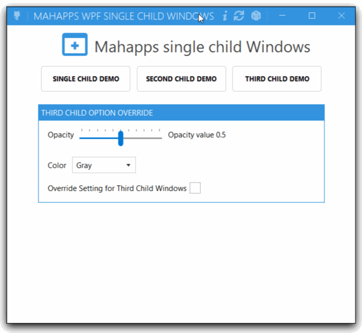
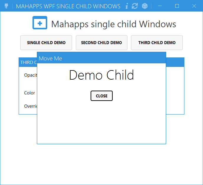
With the First Child it’s an auto-close Windows or your can use the key ESC to close, the second have an icon and the third you can customize as you want.
1. The library
The first, you need to download the library with Nuget Gallery. This library is create by Jan Karger @Punker76.
2. How to use it
In your WPF PowerShell application you need to load the library with this command line
[Void][System.Reflection.Assembly]::LoadFrom('assembly\MahApps.Metro.SimpleChildWindow.dll')
Now you must add code in your XAML code.
3. The XAML code part
3.1 Add the Namespace
in your XAMl you need to add this line
xmlns:simpleChildWindow="clr-namespace:MahApps.Metro.SimpleChildWindow;assembly=MahApps.Metro.SimpleChildWindow"
3.2 Create a single Child
To create a child we have some option look the code for a single child.
<simpleChildWindow:ChildWindow
                 HorizontalContentAlignment="Stretch"
                 VerticalContentAlignment="Stretch"
                 Padding="15"
                 Title="TestChild 1">
  <Grid>
    <Label>Your content</Label>
  </Grid>
</simpleChildWindow:ChildWindow>
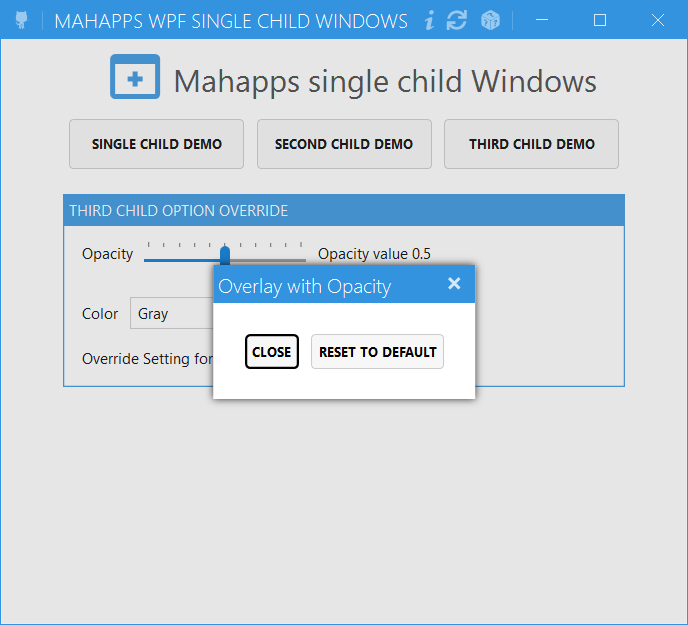
3.3 With Overlay
A modal ChildWindow uses by default the GrayBrush3 from MahApps for the OverlayBrush. So the overlay hides the complete content. You can use a SolidColorBrush with an opacity to make the overlay transparent.
Becarefull in Mahapps 2.0 brush are renamed you can find them here
| Old Keys | New Key |
|---|---|
| Gray1 | MahApps.Colors.Gray1 |
| Gray2 | MahApps.Colors.Gray2 |
| Gray3 | MahApps.Colors.Gray3 |
| Gray4 | MahApps.Colors.Gray4 |
| Gray5 | MahApps.Colors.Gray5 |
| … | … |
How to in XAML code
<simpleChildWindow:ChildWindow
                               Name="SCDE3"
                               Title="Overlay with Opacity"
                               Padding="15"
                               AllowMove="True"
                               ShowCloseButton="True">

  <simpleChildWindow:ChildWindow.OverlayBrush>
    <SolidColorBrush Opacity="0.8" Color="{StaticResource MahApps.Colors.Gray2}" />
  </simpleChildWindow:ChildWindow.OverlayBrush>

  <StackPanel Margin="20">
    <StackPanel Orientation="Horizontal">
      <Button Name="XClose" Margin="5" Content="Close" />
      <Button Margin="5" Content="Reset To Default" />
    </StackPanel>
  </StackPanel>
</simpleChildWindow:ChildWindow>
3.3 Without Shadow
<simpleChildWindow:ChildWindow x:Name="child02"
                                 Title="Testing..."
                                 ChildWindowHeight="300"
                                 ChildWindowWidth="400"
                                 EnableDropShadow="False">

    <!--  Content  -->
  </simpleChildWindow:ChildWindow>
4.0 you can Customize with PowerShell
How to find all property for this Child windows.
[Void][System.Reflection.Assembly]::LoadFrom('assembly\MahApps.Metro.SimpleChildWindow.dll')
$Child = [MahApps.Metro.SimpleChildWindow.ChildWindow]::new()
$Child

AllowMove                   : False
OffsetX                     : 0
OffsetY                     : 0
IsModal                     : True
OverlayBrush                : #00FFFFFF
CloseOnOverlay              : False
CloseByEscape               : True
ShowTitleBar                : True
TitleBarHeight              : 30
TitleBarBackground          : #00FFFFFF
TitleBarNonActiveBackground : #FF808080
NonActiveBorderBrush        : #FF808080
TitleForeground             : #FF000000
Title                       :
TitleCharacterCasing        : Normal
TitleHorizontalAlignment    : Stretch
TitleVerticalAlignment      : Center
TitleTemplate               :
TitleFontSize               : 12
TitleFontFamily             : Segoe UI
Icon                        :
IconTemplate                :
ShowCloseButton             : False
CloseButtonStyle            :
CloseButtonCommand          :
CloseButtonCommandParameter :
IsOpen                      : False
ChildWindowWidth            : NaN
ChildWindowHeight           : NaN
ChildWindowImage            : None
EnableDropShadow            : True
AllowFocusElement           : True
FocusedElement              :
GlowBrush                   : #FF000000
NonActiveGlowBrush          : #FF808080
IsAutoCloseEnabled          : False
AutoCloseInterval           : 5000
IsWindowHostActive          : True
ChildWindowResult           :
ClosedBy                    : None
CloseButtonToolTip          : Close
Content                     :
HasContent                  : False
ContentTemplate             :
ContentTemplateSelector     :
ContentStringFormat         :
BorderBrush                 :
BorderThickness             : 0,0,0,0
Background                  :
Foreground                  : #FF000000
FontFamily                  : Segoe UI
FontSize                    : 12
FontStretch                 : Normal
FontStyle                   : Normal
FontWeight                  : Normal
HorizontalContentAlignment  : Left
VerticalContentAlignment    : Top
TabIndex                    : 2147483647
IsTabStop                   : True
Padding                     : 0,0,0,0
Template                    :
Style                       :
OverridesDefaultStyle       : False
UseLayoutRounding           : False
Triggers                    : {}
TemplatedParent             :
Resources                   : {}
DataContext                 :
BindingGroup                :
Language                    : en-us
Name                        :
Tag                         :
InputScope                  :
ActualWidth                 : 0
ActualHeight                : 0
LayoutTransform             : Identity
Width                       : NaN
MinWidth                    : 0
MaxWidth                    : ∞
Height                      : NaN
MinHeight                   : 0
MaxHeight                   : ∞
FlowDirection               : LeftToRight
Margin                      : 0,0,0,0
HorizontalAlignment         : Stretch
........Cut to long.......
Opacity                     : 1
OpacityMask                 :
BitmapEffect                :
Effect                      :
BitmapEffectInput           :
CacheMode                   :
Uid                         :
Visibility                  : Visible
ClipToBounds                : False
Clip                        :
SnapsToDevicePixels         : False
IsFocused                   : False
IsEnabled                   : True
IsHitTestVisible            : True
IsVisible                   : False
Focusable                   : True
PersistId                   : 0
IsManipulationEnabled       : False
AreAnyTouchesOver           : False
AreAnyTouchesDirectlyOver   : False
AreAnyTouchesCapturedWithin : False
AreAnyTouchesCaptured       : False
TouchesCaptured             : {}
TouchesCapturedWithin       : {}
TouchesOver                 : {}
TouchesDirectlyOver         : {}
DependencyObjectType        : System.Windows.DependencyObjectType
IsSealed                    : False
Dispatcher                  : System.Windows.Threading.Dispatcher
4.1 Modify with powershell now
In this example I just modify Opacity and Color with the combobox but you can also use the brush in point 3.3
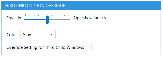
In this example I modify Overlay and colors but you can activate mavable windows, size, or other 😉.
$WPF_Third_Child.Add_Click({

    if ($WPF_Override.IsChecked -eq $True){

        $WPF_SCDE3.IsOpen = $True
        $WPF_SCDE3.OverlayBrush.Opacity = $WPF_Opacity.Value
        $WPF_SCDE3.OverlayBrush.Color = $WPF_Colors.SelectionBoxItem
        $WPF_Override.IsChecked = $false


    }
    else{

    $WPF_SCDE3.IsOpen = $True
    $WPF_SCDE3.OverlayBrush.Opacity = "0.2"
    $WPF_SCDE3.OverlayBrush.Color = "Gray"
    $WPF_Override.IsChecked = $false
    }
    $WPF_Override.IsChecked = $false

})

My project is available on Github here
Thank’s for reading.
Written by Jérôme Bezet-Torres @JM2K69.