
Material Design Object
Happy Halloween in this post I used The MaterialDesign Theme for this special Event.
1. Kaxaml Editor
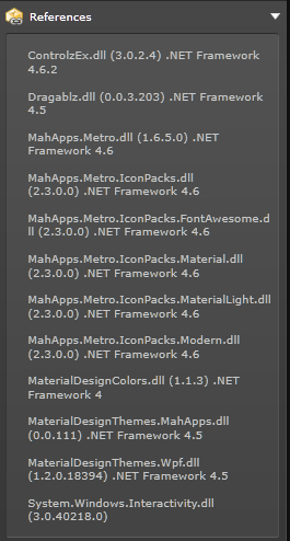
1.1 Add References
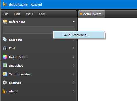
In The Kaxaml editor you can add some reference : you need to add all library for your project, in this example I need
- Mahapps
- DragaBlz
- MaterialDesign
1.2 The default Page or Windows
By default Kaxaml create a default Document with this code :
<Page xmlns="http://schemas.microsoft.com/winfx/2006/xaml/presentation"
      xmlns:x="http://schemas.microsoft.com/winfx/2006/xaml">
	<Grid>

	</Grid>
</Page>
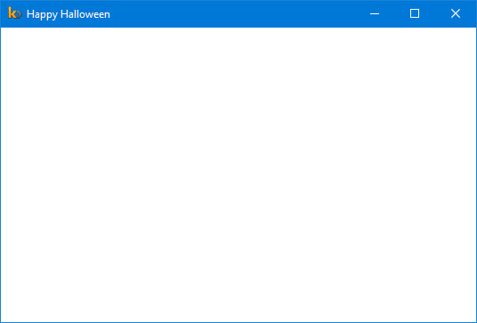
When you insert object you can view the result in your application, but you can have the the possibility create a windows with this code. I include all you need to create a simple windows.
<Window
        xmlns="http://schemas.microsoft.com/winfx/2006/xaml/presentation"
        xmlns:x="http://schemas.microsoft.com/winfx/2006/xaml"
        xmlns:dragablz="clr-namespace:Dragablz;assembly=Dragablz"
        xmlns:materialDesign="clr-namespace:MaterialDesignThemes.Wpf;assembly=MaterialDesignThemes.Wpf"
        Title="Happy Halloween" Height="370" Width="550">
	<Grid>

	</Grid>
</Window>
To Show the result you need to press F5
2. Material Design Object
2.1 Button
With Material Design you can choose for all you object the color and the accent.
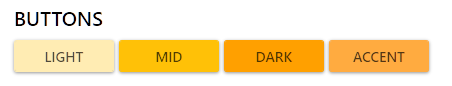
The XAML code :
<Button Style="{StaticResource MaterialDesignRaisedLightButton}" Margin="5 0 0 0 " Width="100" >LIGHT</Button>
                  <Button Style="{StaticResource MaterialDesignRaisedButton}" Margin="5 0 0 0 " Width="100"  >MID</Button>
                  <Button Style="{StaticResource MaterialDesignRaisedDarkButton}" Margin="5 0 0 0 " Width="100" >DARK</Button>
                  <Button Style="{StaticResource MaterialDesignRaisedAccentButton}" Margin="5 0 0 0 " Width="100" >ACCENT</Button>
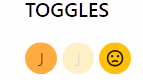
2.2 Toggles
For toggles object the same this is available.
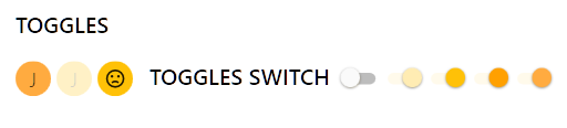
<ToggleButton Content="J" Style="{StaticResource MaterialDesignActionAccentToggleButton}" IsChecked="False" Margin="5 0 0 0 " ToolTip="Toogle not Checked"/>
<ToggleButton Content="J" Style="{StaticResource MaterialDesignActionToggleButton}" IsEnabled="False" Margin="5 0 0 0 " ToolTip="Toogle Disabled"/>
<ToggleButton Style="{StaticResource MaterialDesignActionToggleButton}" Margin="5 0 0 0 " ToolTip="Toggle"> <ToggleButton.Content>
<materialDesign:PackIcon
Kind="EmoticonSad" />
</ToggleButton.Content>
<materialDesign:ToggleButtonAssist.OnContent>
<materialDesign:PackIcon
Kind="EmoticonHappy" />
</materialDesign:ToggleButtonAssist.OnContent>
</ToggleButton>
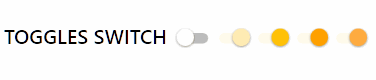
<TextBlock Style="{DynamicResource MaterialDesignTitleTextBlock}" Margin="15 0 0 0" >TOGGLES SWITCH</TextBlock>
<ToggleButton Style="{StaticResource MaterialDesignSwitchToggleButton}" Margin="10 0 0 0 " ToolTip="Default ToggleButton Style" />
<ToggleButton Style="{StaticResource MaterialDesignSwitchLightToggleButton}" Margin="5 0 0 0 " IsChecked="True" />
<ToggleButton Style="{StaticResource MaterialDesignSwitchToggleButton}" Margin="5 0 0 0 " IsChecked="True" />
<ToggleButton Style="{StaticResource MaterialDesignSwitchDarkToggleButton}" Margin="5 0 0 0" IsChecked="True" />
<ToggleButton Style="{StaticResource MaterialDesignSwitchAccentToggleButton}" Margin="5 0 0 0" IsChecked="True" />
For Toggles there is to state check and not :
And Toogles switch. you always have the same possibility.
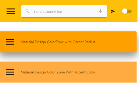
3. NavBar
all people who have a phone that works with Android you necessarily know these navigation bars

Here some code :
 <materialDesign:ColorZone
              Mode="PrimaryMid"
              Padding="16"
              Margin="10 10 0 0"
              Width="450">
              <DockPanel>
                <ToggleButton
                  Style="{StaticResource MaterialDesignSwitchAccentToggleButton}"
                  VerticalAlignment="Center"
                  DockPanel.Dock="Right" />
                <StackPanel
                  Orientation="Horizontal"
                  materialDesign:RippleAssist.IsCentered="True">
                  <ToggleButton
                    Style="{DynamicResource MaterialDesignHamburgerToggleButton}" />
                  <materialDesign:ColorZone
                    Mode="Light"
                    Padding="8 4 8 4"
                    CornerRadius="2"
                    Panel.ZIndex="1"
                    Margin="16 0 0 0"
                    materialDesign:ShadowAssist.ShadowDepth="Depth1">
                    <Grid>
                      <Grid.ColumnDefinitions>
                        <ColumnDefinition
                          Width="Auto" />
                        <ColumnDefinition
                          Width="*" />
                        <ColumnDefinition
                          Width="Auto" />
                      </Grid.ColumnDefinitions>
                      <Button
                        Style="{DynamicResource MaterialDesignToolButton}">
                        <materialDesign:PackIcon
                          Kind="Magnify"
                          Opacity=".56" />
                      </Button>
                      <TextBox
                        Grid.Column="1"
                        Margin="8 0 0 0"
                        materialDesign:HintAssist.Hint="Build a search bar"
                        materialDesign:TextFieldAssist.DecorationVisibility="Hidden"
                        BorderThickness="0"
                        MinWidth="200"
                        VerticalAlignment="Center" />
                      <Button
                        Style="{DynamicResource MaterialDesignToolButton}"
                        Grid.Column="2">
                        <materialDesign:PackIcon
                          Kind="Microphone"
                          Opacity=".56"
                          Margin="8 0 0 0" />
                      </Button>
                    </Grid>
                  </materialDesign:ColorZone>
                  <Button
                    Style="{DynamicResource MaterialDesignToolForegroundButton}"
                    Margin="8 0 0 0"
                    Panel.ZIndex="0">
                    <materialDesign:PackIcon
                      Kind="Send" />
                  </Button>
              </StackPanel>
            </DockPanel>
          </materialDesign:ColorZone>
4. Other Objects
4.1 Flipper
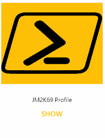
The Flipper Object is compose into One object with two Part The frontContent and the BackContent
<materialDesign:Flipper Style="{StaticResource MaterialDesignCardFlipper}" Margin="10 15 0 0">
                <materialDesign:Flipper.FrontContent>
                  <Grid
                    Height="256"
                    Width="200">
                    <Grid.RowDefinitions>
                      <RowDefinition
                        Height="160" />
                      <RowDefinition
                        Height="*" />
                    </Grid.RowDefinitions>
                      <materialDesign:ColorZone
                        Mode="PrimaryMid"
                        VerticalAlignment="Stretch">
                        <Image
                            Source="Ressources/avatar.png"
                            Stretch="Fill" />
                            </materialDesign:ColorZone>
                          <StackPanel
                            Grid.Row="1"
                            HorizontalAlignment="Center"
                            VerticalAlignment="Center">
                            <TextBlock>
                            JM2K69 Profile
                          </TextBlock>
                            <Button
                              Style="{StaticResource MaterialDesignFlatButton}"
                              Command="{x:Static materialDesign:Flipper.FlipCommand}"
                              Margin="0 4 0 0">
                            SHOW
                          </Button>
                          </StackPanel>
                        </Grid>
                      </materialDesign:Flipper.FrontContent>
                <materialDesign:Flipper.BackContent>
                        <Grid
                          Height="256"
                          Width="200">
                          <Grid.RowDefinitions>
                            <RowDefinition
                              Height="Auto" />
                            <RowDefinition
                              Height="*" />
                          </Grid.RowDefinitions>
                          <materialDesign:ColorZone
                            Mode="PrimaryMid"
                            Padding="6">
                            <StackPanel
                              Orientation="Horizontal">
                              <Button
                                Style="{StaticResource MaterialDesignToolForegroundButton}"
                                Command="{x:Static materialDesign:Flipper.FlipCommand}"
                                HorizontalAlignment="Left">
                                <materialDesign:PackIcon
                                  Kind="ArrowLeft"
                                  HorizontalAlignment="Right" />
                              </Button>
                              <TextBlock
                                Margin="8 0 0 0"
                                VerticalAlignment="Center">
                              SHOW ME
                            </TextBlock>
                            </StackPanel>
                          </materialDesign:ColorZone>
                          <Grid
                            Grid.Row="1"
                            Margin="0 6 0 0"
                            HorizontalAlignment="Center"
                            VerticalAlignment="Top"
                            Width="172">
                            <Grid.RowDefinitions>
                              <RowDefinition />
                              <RowDefinition />
                              <RowDefinition />
                              <RowDefinition />
                            </Grid.RowDefinitions>
                            <TextBox
                              materialDesign:HintAssist.Hint="First name"
                              materialDesign:HintAssist.IsFloating="True"
                              Margin="0 12 0 0">
                            Jérôme
                          </TextBox>
                            <TextBox
                              Grid.Row="1"
                              materialDesign:HintAssist.Hint="Last name"
                              materialDesign:HintAssist.IsFloating="True"
                              Margin="0 12 0 0">
                            Bezet-Torres
                          </TextBox>
                            <StackPanel
                              Grid.Row="2"
                              Orientation="Horizontal"
                              Margin="0 12 0 0"
                              HorizontalAlignment="Right">
                              <TextBlock
                                VerticalAlignment="Center">
                              Email Contact
                            </TextBlock>
                              <ToggleButton
                               Style="{StaticResource MaterialDesignSwitchAccentToggleButton}" Margin="8 0 0 0"></ToggleButton>
                            </StackPanel>
                            <StackPanel
                              Grid.Row="3"
                              Orientation="Horizontal"
                              Margin="0 12 0 0"
                              HorizontalAlignment="Right">
                              <TextBlock
                                VerticalAlignment="Center">
                              Telephone Contact
                            </TextBlock>
                              <ToggleButton
                                Margin="8 0 0 0"></ToggleButton>
                            </StackPanel>
                          </Grid>
                        </Grid>
                      </materialDesign:Flipper.BackContent>
               </materialDesign:Flipper>
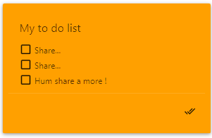
4.2 My To Do List
   <materialDesign:Card
  Background="{DynamicResource PrimaryHueDarkBrush}"
  Foreground="{DynamicResource PrimaryHueDarkForegroundBrush}"
  Width="300"
  Padding="8"
  Margin="15 15 0 0">
  <StackPanel>
    <TextBlock
      Margin="16 16 12 8"
      FontSize="16">
    My to do list
  </TextBlock>
    <CheckBox
      Margin="16 4 16 0"
      Style="{StaticResource MaterialDesignUserForegroundCheckBox}">
    Share...
  </CheckBox>
    <CheckBox
      Margin="16 4 16 0"
      Style="{StaticResource MaterialDesignUserForegroundCheckBox}">
    Share...
  </CheckBox>
    <CheckBox
      Margin="16 4 16 0"
      Style="{StaticResource MaterialDesignUserForegroundCheckBox}">
    Hum share a more !
  </CheckBox>
    <Separator
      Style="{StaticResource MaterialDesignLightSeparator}" />
    <StackPanel
      Margin="8 0 8 8"
      Orientation="Horizontal"
      HorizontalAlignment="Right">
      <Button
        HorizontalAlignment="Right"
        Style="{StaticResource MaterialDesignToolForegroundButton}"
        Width="30"
        Padding="2 0 0 0"
        materialDesign:RippleAssist.IsCentered="True">
        <materialDesign:PackIcon
          Kind="CheckAll" />
      </Button>
    </StackPanel>
  </StackPanel>
</materialDesign:Card>
5. You can Add some Icon
I use Metro Studio 5.0 you can grab it here you can save export and modify all icon.
Here an example for Halloween :
<Path Data="M27.312851,4.5059343C27.679855,4.5039201 28.063825,4.5559216 28.455854,4.6819578 31.330849,5.6049219 32.438818,8.7928768 31.844826,14.427828 30.925819,23.151736 28.971844,27.414692 25.874864,27.456685 24.822866,27.469683 24.107839,27.035668 23.667839,26.633694L23.740837,26.531706 23.797844,26.279694C24.808828,21.964737 25.409839,16.044816 25.480823,12.427848 25.544849,9.1899067 25.094837,6.9169198 24.706838,5.5789214L24.645864,5.4028974C25.256824,4.9939051,26.210863,4.5099016,27.312851,4.5059343z M4.6928991,4.5059343C5.8208874,4.5179582,6.7918938,5.0309535,7.3938826,5.4449506L7.3688582,5.5289341C6.9739006,6.8699232 6.5158933,9.1559101 6.5788816,12.428825 6.6509031,16.066788 7.2558821,22.007765 8.2718714,26.326691L8.3368738,26.599698 8.3409022,26.605679C7.9038914,27.014672 7.1798938,27.47066 6.1018928,27.456685 3.0868839,27.416707 0.90988608,22.667733 0.13187248,14.430818 -0.57808714,6.8969007 1.7259246,5.2589174 3.5218807,4.6819578 3.9239183,4.5529309 4.316923,4.501906 4.6928991,4.5059343z M19.922849,4.1449152C21.951837,4.1409479,23.36486,5.9099112,23.377861,5.9279166L23.395866,5.9509264C23.728874,7.0958729 24.179861,9.2499033 24.118826,12.401848 24.045828,16.125807 23.42083,21.915726 22.47088,25.974705 22.342829,26.15671 21.341854,27.472674 19.319885,27.542681 18.080873,27.584673 17.022892,27.059716 16.355841,26.06473L16.355841,5.9819322C17.689884,4.3349157,19.277893,4.1459528,19.922849,4.1449152z M12.075881,4.1449152C12.725903,4.1459528,14.355844,4.3369299,15.689887,6.0098858L15.689887,26.029696C15.022897,27.047692 13.934886,27.584673 12.681897,27.542681 10.783891,27.476702 9.7638729,26.313691 9.5439032,26.0217 8.5879114,21.959733 7.963889,16.138808 7.8888768,12.401848 7.826865,9.207851 8.29891,7.0378905 8.6328934,5.9049063 8.805867,5.6949478 10.172869,4.1409479 12.075881,4.1449152z M15.134895,0L17.577885,0C18.375856,-1.1518023E-07,19.022888,0.6469658,19.022888,1.4449922L19.022888,2.9019468C18.185854,3.0489183 17.06287,3.4319709 16.013861,4.4129177 15.233894,3.6829448 14.408884,3.2839623 13.689891,3.0649701L13.689891,1.4449922C13.689891,0.6469658,14.336862,-1.1518023E-07,15.134895,0z" Stretch="Uniform" Fill="#FFEC9123" Width="138" Height="138" Margin="-465 90 0 0" RenderTransformOrigin="0.1,0.1">
                <Path.RenderTransform>
                  <TransformGroup>
                    <TransformGroup.Children>
                      <RotateTransform Angle="0" />
                      <ScaleTransform ScaleX="1" ScaleY="1" />
                    </TransformGroup.Children>
                  </TransformGroup>
                </Path.RenderTransform>
              </Path>
The result is awesome :

The My Application final :
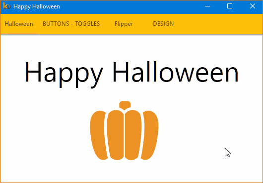
Happy Halloween ! !
Written by Jérôme Bezet-Torres @JM2K69.